
Karim Rashid on showing his true colours
By Laura Goldstein
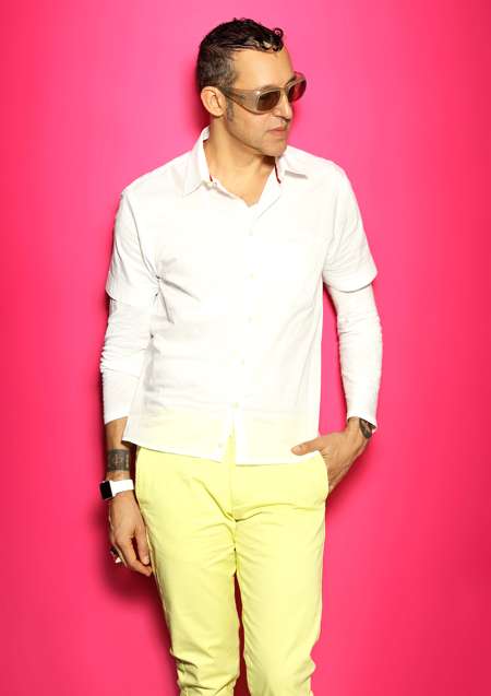 Karim Rashid takes me by surprise by wearing yellow (not his usual pink attire,) for our Skype interview from New York. But then the Cairo-born Canadian product, furniture, restaurant and hotel interiors designer is often unpredictable; a whirling dervish of ideas, opinions, New Age philosophy, criticism and wit. Once crowned The Prince of Plasticby Time Magazine, his curvaceous plastic utilitarian Garbowastepaper basket designed for Canadian company, Umbra in 1996, kicked off his career. It’s since sold over 7 million units world-wide and still going strong. His Oh Chairalso for Umbra in 1999,is in the permanent collection of MoMA in San Francisco. At 57, he eschews trends in favour of innovation, an agent provocateur synonymous with over 4,000 designs and 300 international awards.
Karim Rashid is a keynote speaker at IDS-Vancouver Sept 20thto 23rd 2018 on the Caesarstone Stage sponsored by BoConcept.
You use colour like a political statement – to provoke and inspire. There’s a fine line between over-the-top design of a hotel lobby and what the consumer finds acceptable in their own living room. How do you get it right?
Well I don’t know if I get it right all the time. Sometimes it’s very wrong! My reaction to that is to say that people will accept colour (there are over 16,000 variations,) on a micro level. Like a mousepad or kitchen gadgets. In the high-tech industry you see colour in speakers or I remember when Nikon brought out a pink digital camera in 2013. But when you start getting into large furnishings you start narrowing your audience. All of a sudden only 5% of consumers will buy an orange lounge chair.
So, in fact, as you design larger and larger, consumer consumption gets smaller and smaller so that’s something I’m aware of.
Why is Western culture so afraid of colour?
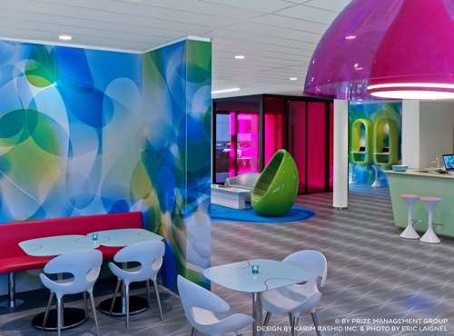
This is a phenomenon I’ve noticed for decades. In countries like India, Mexico, Chile even Singapore those countries had so much colour in their clothing and makeup for centuries. In fact, the closer you are to the equator, the more colourful the culture. But now, even those cultures are becoming very neutral. You’d think it would be the opposite – Northern countries like Canada, for example, where it’s dark and cold in winter should wear bright colours. The visual age has actually created a shrinking more homogeneous approach to colour and everyone is just copying one another. And not just interiors but building exteriors. The opposite is the extension of OCAD University in Toronto designed by Wil Alsop and how beautiful that project is – but he’s a great painter. I’m sure he ostracized a lot of potential clients, just like I do. Lots of clients are afraid of meeting me. They say ‘we’ll hire you but we don’t want pink.’ In a way, I’ve been pigeon-holed.
Why is pink your favourite colour?
It’s positive, it’s the new black. So many men have issues with it because they still think it’s too feminine. I’m trying to break down gender issues in every product I design.
What are you working on now that takes the fear out of accepting colour?
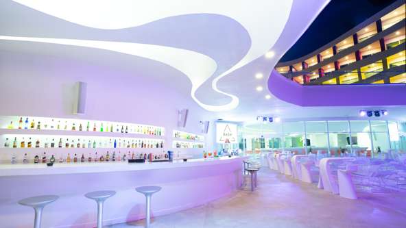
Right now I’m working on about 11 hotels around the world including budget hotels for the Radisson Hotel Group’s, Prizeotelsacross Germany and a hospital in Tel Aviv. My staff and I are looking at our screens and talking about colours and I find myself becoming more conservative.
Really?
 Yes. When I open up renderings I did 15 years ago I’m shocked at the colours I composed. Well, there’s always a compromise because I want the project to happen. But how much do I compromise? Last year there were three restaurant interiors I was working on in Norway, Ukraine and Athens. I lost all three clients because all three wanted this boring, post-industrial look of brown, exposed brick, or a wall of old books – I just don’t do that.
If anything needs a redesign with colour it’s hospitals where people are ill and often afraid. What are you doing for the hospital in Tel Aviv?
I’m just starting that project but I’ll do what I always do for hotels and that is an amazing space with a high energy vibe. I think that you can make people feel better and get better with a positive feeling. I spent quite a lot of time in hospital in New York when I had cancer and it was incredibly depressing not only because you think you’re going to die but because I had to hang out in this disgusting, drab place for weeks on end.
Do you dream in colour?
 Well I never dream in black and white. Hmmm, what about if you’re colour blind? Actually, I designed a building in Harlem, New York called 329 Pleasant Avenue for a client who was colour blind so I managed to get away with some really great colours!
Karim Rashid will give a talk at the first large-scale Canadian exhibition of his work entitled Karim Rashid: Cultural Shaping on October 11that the Ottawa Art Gallery. An alumnus of Carleton University’s Industrial Design programme, he received an honourary Doctorate from them in 2016.